
States are the different looks an object can have, such as Normal, Hover, Selected, Visited and Disabled. Built-in states such as Hover switch on their own as the learner uses the object; others change through interactions.
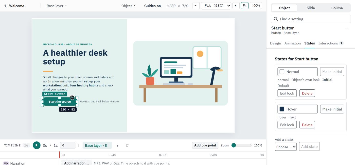
See an object's states
- #
Select the object on the slide.
- #
In the Inspector, open the States tab. Each state is listed with its name and tags such as Initial and Default.
- #
Select a state's preview to see that look on the slide. Nothing in the course changes.
- #
Choose Show initial appearance, or leave the States tab, to go back to the normal look.
Add a state
- #
On the States tab, open Add a state and choose a built-in state the object does not have yet (Normal, Hover, Down, Selected, Visited, Focus, Disabled or Hidden), or Custom… and type a name.
- #
Choose Add state. The new state starts looking like Normal. An object with no states also gets an empty Normal state, because Hover, Focus and Down only show from Normal.
Change how a state looks
- #
Choose Edit look on the state's row. The ribbon switches to the Format tab and reads Editing Hover: changes on the ribbon apply only to this state. The Inspector's Design tab shows the same banner.
- #
Use the ribbon as usual: Shape fill, Shape outline, outline weight and dashes, Shape effects and the Text tab change that state only, and the slide shows it. Transparency on the ribbon and Format details change it too. Double-click the object to type that state's own text.
- #
Choose Back to Normal, on the ribbon or in the banner, when you are done.
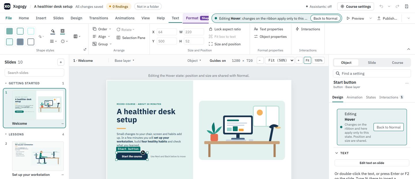
Settings that every state shares stay off while you edit a state, with the reason on the control: quick styles, rotation, corner radius, the default formatting and saved styles, position and size, crop, fit, alt text, Replace image, playback, table content, the format painter, vertical alignment, text direction and text styles.
Clicking a state's row only previews it. The slide says Previewing the Hover state. Click Edit look to change it., and the ribbon stays off until you choose Edit look. Lock aspect ratio stays available while you edit a state, because it only changes how resizing works.
Rename or delete a state
- #
Choose Rename on a custom state's row, type the New name and choose Rename. Every interaction that sets, watches or tests the state is renamed in the same step; the dialog says Interactions that use this state are renamed with it.
- #
Choose Delete on a row and confirm. If it was the initial state, the object starts in Normal instead.
- #
A state an interaction still uses cannot be deleted. Xogogy lists those interactions; choose Show in Interactions, change them, then delete the state.
Choose how the object starts
- #
On the States tab, find the state the object should start in.
- #
Choose Make initial on that row. The Initial tag moves to it.
Change a state with an interaction
- #
Select the object that the learner will use.
- #
On the Inspector's Interactions tab, choose + Add interaction.
- #
Under THEN, choose Change state of object, pick the object and the state, such as Visited or Disabled.
- #
Choose Save.
Tip: To react to a state, use the WHEN event an object's state changes, for example to show a "Well done" message once every item reads Visited.
Every state change is one step you can undo. States brought in from an imported course keep their own looks. A state's own position, size and extra pictures are kept from the import but cannot be edited; Replace image changes the picture for every state.
Still stuck?
Write to support@xogogy.com. A person at GForce Learning reads every message. Include the app version from Help › About Xogogy.